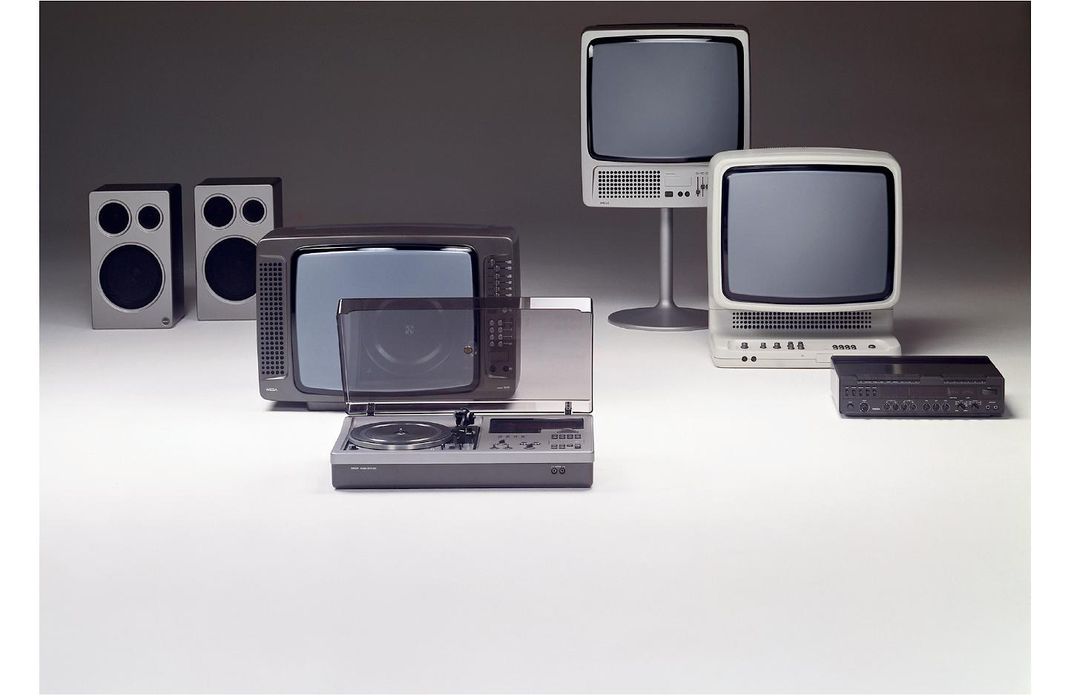
I first met Hartmut Esslinger—whom the Cooper Hewitt, Smithsonian Design Museum honored for lifetime achievement in this year’s National Design Awards—when I interviewed him for Forbes in 1999. For a designer of seamlessly perfect consumer products, his hair back then seemed to have defied any attempt at combing. Today, nothing has changed, except for the graying of that resistant hair.
At the time of our first interview, the founder of Frog Design (which Esslinger sold between 2005 and 2007) was setting what turned out to be a very high standard for the look and feel of Apple products.
The whimsical sounding name Frog simply stands for Esslinger’s home country, the Federal Republic of Germany. The company worked with Steve Jobs to revolutionize computer design with the Apple IIc and the Mac SE, a small, one-piece machine that changed forever the way computers were built and bought. Though the charismatic Jobs is often given credit for making design essential to the success of Apple, Esslinger was his guru.
Born in Beuren, Germany in 1944, Esslinger later served as a logistics officer in the German army. “I had the leadership gene,” he told me recently, his accent still more than a touch Teutonic. He began drawing as a teenager, and graduated from design school at the age of 25, much to the concern of his mother. She had lost family members in the Nazi death camps, and feared that the arts would once again be condemned, so she burned his sketchbooks. Undeterred, Esslinger followed his leadership gene and formed Esslinger Design in 1969 (which later became Frog Design). The company was hired in 1974 by Sony, where Esslinger helped create the iconic Trinitron color television.
This coming October, a ceremony and dinner at the Cooper Hewitt Design Museum in New York City will celebrate Esslinger and the other winners of the 18th annual National Design Awards. The ceremony coincides with National Design Week, and honors 11 individuals and organizations described by Cooper Hewitt director Caroline Baumann as having “elevated our understanding of what great American design is and what it can do to improve the world.”
Along with Esslinger, this year’s winners are: Susan S. Szenasy (Director’s Award), Craig L Wilkins (Design Mind), Design Trust for Public Space (Corporate & Institutional Achievement), Jennifer Morla (Communication Design), Slow and Steady Wins the Race (Fashion Design), Stamen Design (Interaction Design), Deborah Berke Partners (Interior Design), Surfacedesign (Landscape Architecture) and Joe Doucet (Product Design).
Recently, I met with Esslinger, Morla, and two of the three principals at Surfacedesign.


I was someone who considered the Mac SE a miraculous machine; on its tiny 7 by 6-inch screen I wrote three books. So it was a surprise when Esslinger told me the SE was not a commercial success, despite the enthusiasm of writers and editors and its regular appearance on Jerry’s desk in “Seinfeld.”
As seamless as the little SE was, according to Esslinger the process of producing it was fractured. “The Mac team was a group of idiots,” he says. “They didn’t have any idea how to make a commercial product. The SE was a supply-side nightmare.”
He also pointed out that because Jobs was notoriously abusive to his employees, many at Apple actually sabotaged his efforts. “But Steve and I hit it off,” he says, “and I knew all the tricks.”
When Jobs was forced out of Apple, Esslinger broke with the company and went with Jobs to a new venture, NeXT, which produced a remarkable line of groundbreaking hardware designs. His work in later years—for Lufthansa, Olympus cameras, Motorola, General Electric and many other companies—has always been guided by the principle stated in the title for his book about the history of Apple design, Keep It Simple.
Esslinger complains that despite a rise in the importance of good design, “there’s still a lot of crap being produced.” In his mid-70s, he goes on designing, he says, “because the crap keeps coming.” One of the biggest surprises of my encounter with the great designer, which included several email exchanges, was his regular use of emojis.


I sat down with James A. Lord and Roderick Wyllie, two of the three principals at Surfacedesign (the third is Geoff di Girolamo) under rough-hewn redwood beams in their sprawling office space—a former fire station—on Pier 33 on San Francisco’s Embarcadero waterfront.
We spoke in a conference room with a breeze off the bay wafting through a window, surrounded by drawings of current projects tacked to the walls. In the large main room, a dozen or so young landscape architects worked on their computers. Surfacedesign, founded in 2001, works in scales ranging from residential gardens to a 40-acre park currently being designed for Seattle.
The company has created a plaza at the south end of the Golden Gate Bridge to commemorate the famed structure’s 75th anniversary, and worked on the landscape renewal of Land’s End, one of the most appealing—and most neglected—of San Francisco’s natural wonders. A large planning drawing taped to the wall of the conference room depicts a future waterfront public park in front of the new arena for the NBA champion Golden State Warriors.
Farther afield—quite a bit farther—the firm created the IBM Plaza in Honolulu, and is currently redesigning the area around the international airport at Auckland in New Zealand, where James Lord’s mother is from.
This is one of several projects in that country.
Lord illustrates the firm’s dedication to what he calls “culturally based design” when he reminisces that as a kid flying in and out of Aukland he used to see goats and sheep grazing and Maoris on horseback around small encampments. Eventually, he says, this characteristic scene gave way to “global homogenization,” making it indistinguishable from countless airports anywhere and everywhere. “You couldn’t tell Aukland from Oakland,” Lord says. Surfacedesign is now working to make the area once again look like the “entrance to a unique country.”
Lord studied architecture at the University of Southern California and landscape design at Harvard, and Wyllie studied music as an undergraduate at the University of California at Santa Cruz (and played in punk bands) and also did his graduate work at Harvard. Both seem happy combinations of pragmatist and philosopher.
They look at piles of dirt and see the future.
Projects like the Golden Gate Bridge Plaza are conceived by the minds at Pier 33, but they are built by men and women in hardhats who may not have experienced what Wyllie describes a “a sense of connection between the built and natural world.” Yet the partners told me that they hope to give “people who normally build freeways something more meaningful to work on.”


Jennifer Morla, winner of the award for Communication Design (which, she told me, is graphic design with more dimensions), has worked for some of the most prestigious companies in the San Francisco Bay area, including Levi’s, Design Within Reach, Wells Fargo, and the public TV and radio station KQED. The chief executive of the highly successful Morla Design, which she founded in 1984, she looks every inch a designer, with a precision haircut that manages not to look precise and impressive dark frame eyeglasses.
Though she was born and grew up Manhattan and graduated from the University of Hartford in Connecticut and the Massachusetts College of Art in Boston, she established her own company in San Francisco because, she says, in the early 1980s the city had many fewer design firms than New York City.
As a graphic artist and designer, Morla has produced a spectacular array of posters, including one for San Francisco’s bid for the 2012 Olympics, another to honor dissent in Iran after a disputed election, and one to celebrate the Mexican Museum in San Francisco.
But as a communication designer, her work has those added dimensions she talks about. On some assignments, she told me, she “takes a company and finds the look and feel of what it’s about.”
For instance, hired in 1991 by Wells Fargo Bank to redesign the ATM card, Morla ended up with a huge job that involved rethinking the entire image of the venerable company. She designed more than 100 pieces of bank material, using the “cachet” of a Western theme (Wells is the oldest bank in the West) to unite a highly decentralized organization.
Thus, a stage coach now rolls through the wide landscape of the Wells Fargo world. This work exemplifies one of Morla’s credos: “A conceptual idea with a pragmatic solution.”
Morla is a designer with the ability to find those solutions in the full spectrum of visual, tactile and philosophical work. Looking at the broad range of Morla’s accomplishments, up to and including interior design, her many dimensions are evident.
Given the assignment of rejuvenating the venerable Levi’s brand, she created the look and feel of Levi’s retail stores, even designing carpets and furniture. Walking into one of these stores, you might get a feeling more Ralph Lauren than Levi Strauss. And yet in all of her work, it’s not easy to see a signature look beyond the inventive visual imagination. This is the way she wants it.
“I don’t have a stylistic approach,” she says. “I look for what’s appropriate for the problem at hand. This is what keeps me interested.”


